blog
Interview with photographer Paula Riff

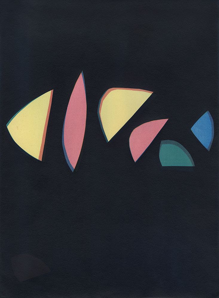
Blue on Green
F-Stop Magazine: How did you first become involved in photography and what led to you working in this medium (and more specifically in camera-less photography) as an artist?
Paula Riff: My first camera was a gift from a cameraman I was friends with while working at a Japanese newspaper in Tokyo. It was a 35 mm Pentax film camera. That was quite a while ago, and my interests have definitely changed since then, but when I returned to the states, I took a few darkroom classes where I learned how to develop film and make silver gelatin prints. That really was a turning point for me and I fell in love with the hands on approach to making and creating images in the darkroom. I spent over twenty years using film cameras of all kinds, different formats, toy cameras, Polaroid cameras and so on and have always been more interested in that way of creating. When digital cameras started taking over the photo world, I began to feel very disconnected to my work and was eager to experiment with historical processes which led to my experimentation with photograms and cameraless imagery and I discovered a whole new way of making work that was completely freeing. It really changed how I approach everything.
F-Stop: The current issue of F-Stop Magazine features your project “Blue is not the sky,” can you tell us about this project? What led to this work?
PR: I had been using all different kinds of objects to make photograms, from rocks, bones and sand just to name a few and then I spent a few years using primarily botanicals. I am a collector of things during daily works and I constantly pick up leaves or flowers that might at some point be used in an image. I was looking at the natural world in a different way where each fallen leaf or part of a leaf gave way in my imagination to a new shape or shadow once placed upon a coated light sensitive piece of paper. But after many years of using botanicals in my work, I began to want to create my own graphic content and that opened up a whole new way of thinking that ultimately led to my new series, “Blue is not the sky”.
Kaleidoscope
F-Stop: Can you discuss your process for making these images, or your creative process more generally? What inspires you to start a project or use particular materials?
PR: I am always looking at different kinds of art and am inspired and influenced by so many different things. I also spend a lot of time thinking about color palettes and shapes and designs and somehow from there I get an idea of what it is I want to make. I start an image by cutting paper and piece shapes and different graphic content together that eventually becomes the basis for a new piece. From there I do color combination tests on paper to decide what colors and how many layers I am going to use. If I am using both cyanotype and gum, then cyan will always be my first layer that is hand coated. These images take lots of time and several days of coating paper, making exposures, developing and then repeating that process again and again until I have the color combination and build up that I want.
In general, experimenting with historical or alternative processes is a much slower way of working and thinking and I think in a very different way about what it is I want to make. I don’t look at the world through a viewfinder anymore, instead I see the world more as a place of different colors and shapes and I am also thinking of positive and negative space. The piece of paper or substrate I start with becomes my canvas and the possibilities it affords me is pretty exciting.
F-Stop: Does your background learning Japanese or working as a translator influence your work in any way?
PR: I lived in Japan for over seven years, and the time and experiences I had there are certainly a large part of who I am for sure. I am very interested in Japanese design and the Japanese aesthetic of subtle and unobtrusive beauty that exists in many aspects of the Japanese arts and culture. Working with historical processes is in some ways a very meditative way of working. One has to slow down and pay attention to the details as well as be open to the unexpected outcomes that may occur and I believe this also appeals to me because of the time I spent in Japan.
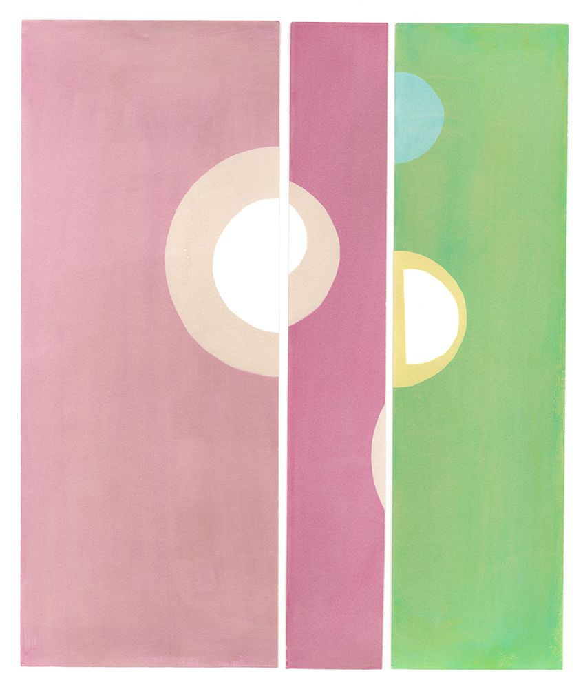
In Pink & Green
F-Stop: What do you hope people experience or feel when they look at your photo-graphs?
PR: The hope is that people will feel a certain emotion in a visceral or intuitive manner rather than an intellect interpretation. Because I am interested in looking at and creating art in its purest form if you will, by focusing on the fundamental elements of shapes, colors and lines while at the same time giving homage to the beauty and simplicity of abstraction, I hope that feelings come across in some way or another, but if not, that is ok too. It is all really a personal thing or individual kind of experience I believe.
F-Stop: Do you have a favorite image in this series? If so, which one and why is it the image that speaks to you most?
PR: That is an interesting question! I guess I do have some favorites but that also changes over time. I originally especially loved “Shades of Blue” because it was made with the intention of “blue is the color of peace and freedom” and now my daughter, who really loves this image as well, just had a tattoo made with part of the design on her arm so it has a special place in my heart because of that. But I also really love the circle pieces, “Dance Party” and “UnDone” because I feel that I am breaking free of the expected rectangle or square image and that excites me and makes me want to push myself further to make work that is unexpected.

Shades of Blue
F-Stop: What photographers or other artists inspire you?
PR: There are so many! I am continually looking at abstract women painters like Lee Krasner, Elaine de Kooning, Helen Frankenthaler and many more who pushed them-selves to make art that was really revolutionary at that time. But I also am inspired by contemporary photographers who are also making cameraless imagery, such as Ali-son Rossiter, Mehgan Riepenhoff, Chris McCaw and so on, and of course I love Calder and Rothko and Matisse! I also find inspiration by looking at the work of my peers who are pushing the boundaries of the medium, but there are way too many to name here.
Thank you so much for your interest in my work and spending time with me. I am thrilled to be a part of F-Stop and am looking forward to all that you do as you go for-ward! Thank you for supporting so many creative artists, it is really important and I am very grateful for this opportunity!
F-Stop: Thank you for sharing a bit about yourself and your work!
To see more of Paula’s work visit the current issue of F-Stop (Nov/Dec 2019) or visit https://www.paulariff.com/ and https://www.instagram.com/paulariffphotography/
Location: Online Type: Abstract, Featured Photographer, Interview
One response to “Interview with photographer Paula Riff”
Leave a Reply
Events by Location
Post Categories
Tags
- Abstract
- Alternative process
- Architecture
- Archives
- Artist residency
- Artist Talk
- Biennial
- Black and White
- Book Fair
- Car culture
- Charity
- Childhood
- Children
- Cities
- Collaboration
- Community
- Cyanotype
- Documentary
- Environment
- Event
- Exhibition
- Faith
- Family
- Fashion
- Festival
- Film Review
- Food
- Friendship
- FStop20th
- Gender
- Gun Culture
- Habitat
- home
- journal
- Landscapes
- Lecture
- Love
- Masculinity
- Mental Health
- Migration
- Museums
- Music
- Nature
- Night
- nuclear
- Photomontage
- Plants
- Podcast
- Portraits
- Prairies
- Religion
- River
- Still Life
- Street Photography
- Tourism
- UFO
- Water
- Zine
[…] Interview with photographer Paula Riff […]